 Pile of junk or beautiful garbage? This one may be the classic case of beauty being in the eye of the beholder.
Here is the latest offering from the company Longneck. This hideous beast is called Dempagon (デムパゴン). This particular version is Dempa-gon ver 2.0 2008 according to the gold label on the header card.
The monster itself is a mish-mash of various items. It is in the theme of Junk Kaiju.... or junkheap... monsters that are made of various debris, or are even themselves moving trash heaps. Maybe Hedorah fits in this family too as he seems to be made from toxic sludge.
The monster itself is a mish-mash of various items. It is in the theme of Junk Kaiju.... or junkheap... monsters that are made of various debris, or are even themselves moving trash heaps. Maybe Hedorah fits in this family too as he seems to be made from toxic sludge.
I've seen a few toys made in this theme, and I know of the monster Garuban from the old television show Captain Ultra. Hopefully I'll soon be reviewing a giant Garuban I got recently. The others I have seen have mainly been large pieces of trash forming a humanoid shape. One monster made by Kaijuken even has an airplane tail sticking out of his ass.
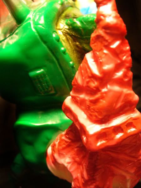
Dempagon is a bit different from these others in that he is made up of some pretty strange items. He is a surreal combination of household items such as a computer monitor, some sort of plug on one arm, an upside down old style television for a head, and what appears to be the Tokyo Tower for his right arm. Either it is a tiny tower, or the other parts are supposed to be enormous.
 The color scheme on this figure is an homage to an old and very awesome vinyl toy of the Barom-1 demon Frankenruge. There has been a new version of Frankenruge made by Rainbow, as well as a Mutant Chaos by Real Head painted in this scheme. Dempagon is slightly different... you can see pictured here that the colors are mirrored from where they appeared on the original toy.
 It looks like someone looked at Dempagon's horns one day (the feet of the upside down television) and thought they resembled the antennae on the vintage Frankenruge. It was a good find, regardless of how it happened.
It seems that Longneck is taking this Dempagon figure in these sorts of directions, as there is a version coming soon that is based on King Joe and one that even resembles a panda bear!
 Header //1 out of 5//:
 I have to say, Longneck has some boring headers. from what I can tell, they all look exactly like this, with the price on the front, and a sticker on the back with the name of the toy. No color except for the gold foil sticker, and the font isn't all that attractive. Meh.
Sculpt //3.5 out of 5//:
Nothing clean about this guy. This is the kind of sculpt, I believe, that people either really like or really dislike. I could be wrong, but sometimes it seems these messy themed toys attract a certain collector and repel many. I really like it, but there are a couple things I wish were different.
As I said above, this guy is a mash up of lots of different parts, most of which seem to be electronic devices... the television, some sort of monitor, the plug... There is even a keyboard and mouse on his back, a cell phone protruding from a black hole in his hip, and what seems to be an electrocardiograph for a pelvis! I really like the assortment of items that I have never seen in a toy like this before.
The addition of the Tokyo Tower for an arm is a bit strange given the size of all the other included items, but I can appreciate the random addition. I believe it makes the figure stand out more than if the arm were simply a sharp household device.
 The figure has some nice textures in places, like the broken parts of the monitor on his chest, the cross beams of the tower arm, and the nondescript garbage textures on the left arm, legs, etc. However, I would like these textures more if they did not look so hand drawn. It is almost as if the main sculpt of the figure had a lot of thought and effort, and the surface was then glossed over. While this is a way to have the toy really feel like a do-it-yourself project, here it feels rushed. Another Longneck toy, Gas Bawer, has awesome texture, and it doesn't look this way. There are even lines etched into Dempagon where you can see where the extra clay was pushed into a ridge along. I think this would have really benefited from a little cleaning up and more thought out textures.
 There isn't much in the way of articulation either. While I will admit knowing virtually nothing about the casting process, I think this toy could benefit from legs that rotate at the hip and a head that turns. As it is now, there is a big seam at the waist which is nicely concealed between two blocks that meet, and the arms rotate at the shoulder. The feet are a little off on mine, which causes some slight balance issues, but this can be corrected with the hairdryer treatment I am sure.
Paint //3.75 out of 5//:
As with the sculpt of this beast, there are parts I like and parts I do not like about it.
I think it is cool that it is an homage to the Frankenruge villain. It is an interesting color scheme and choice. I really like Dempagon's face/head with the large saggy eyeball and the metallics on the feet of the upside-down television. The paint here almost gives a plastic like texture... which sounds kind of stupid now that I look at it typed out because the toy is made of a plastic. But something about it just looks different, and I like it. The shading on the sides of the extended eyeball are a nice touch.
There is a lot of color here, and the application is nice for the most part. The fades and colors chosen all over the body are well executed, ranging from yellow highlights on the back of his head, to the deep, black pit on the left hip.
The part that bothers me actually is the paint on the legs and upper arms. Obviously the point was to mimic the veiny look of the Franenruge, but in my opinion the application is almost clumsy. The airbrush stream is a little wide, and on the red side in particular, it seems like a rushed trace over the sculpted cardiograph lines. While it probably can be argued that this application is reminiscent of a vintage paint application, I think it could have benefited from a little more care and time. This is, after all, an expensive figure, not a cheaply made toy meant for play in the sandbox by children of the 70s.
Coolness //4 out of 5//:
I'm a sucker for these oversized, ugly toys. It is appeasing to me to have someone see a figure such as this and have a "what the hell is this?" type of reaction.
Value //2 out of 5//:
I bought this in the US and paid twice as much as what it sold for in Japan. Ouch. Had I known that were the case beforehand, I probably would not have rushed to order it. But if you can get this for closer to the Japanese price, I think it is a much better value.
Overall //4 out of 5//:
Positives: Large, nice paint for the most part, interesting combination of junk parts to make a unique monster
Negatives: Expensive, bulky, not many poses available, certain elements of its production feel rushed
Yeah, I know I had some issues with parts of this toy, but something about it just draws me in. It's a mess, but in a good way. I don't own anything else that looks like it, but at the same time I think it goes well with such toys as Gas Bawer and Bemon.


 Like the Bemon, the Gas Bawer is shrouded in mystery for me, as I honestly know very little about him. With the Bemon at least I have some background though the old Smogun header. But as far as I know, the Gas Bawer's only background is that he is a relatively new character created from scratch. It has been speculated that the figure was designed by the same person that designed the Bemon figure, and evidently the Gas Bawer was sold in the same Japanese shop. I would like to verify this!
 I'm not positive what is name is, but the head on this snail creature is very phallic. I figured surely it coincidence until photos of the snail's undercarriage showed up!

